0.1529
900 319 0030
x

The Rich are Getting Richer

iasparliament Logo
March 27, 2018

What is the issue?

  • Income inequality between countries has been touted to be reducing, but it has been more gradual than perceived.
  • But inequality within countries is worsening rapidly and only the elites seem to be benefitting across jurisdictions.

What are the generic inequality trends?

  • Current income trends reveal that while inequality between countries has gone down little, but inequality within countries has increased greatly.
  • Yet, on the whole, emergence of countries with large populations like China and India appears to be reducing global inequality due to a middle class boom.
  • Chart 1 - represents two inequality indicators namely “Gini Co-efficient and Palma ration”, both of which indicate decline in global inequality since 2000.
  • Notably, “Gini Index” is a measure of the dispersion of income among the population (0 being perfect equality and 1 being maximal inequality)
  • Palma ratio is the ratio of the share of income of the top 10% of the population to the bottom 40%.


  • Notably, it is important to differentiate between “income and wealth” – while the former is a flow component, the latter is an accumulation over the years. 
  • Elephant curve - This describes percentage changes in incomes across different deciles of population (10 equi-populous income sorted groups).
  • While this curve too recorded a strong growth of middle income groups in the global population, there are two important caveats to be taken note of.

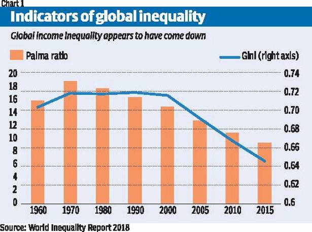
What is the problem with the above figures?

  • Elephant’s curve is based on proportionate increases, which will inherently make increases greater if initial incomes are low and vise-versa.
  • For example, if the 5th docile earns $1000 per-capita, a $200 increase would mean 20% raise, while for a higher docile that earn $20,000 per capita, a $200 raise would merely account for 1% increase on the graph.   
  • Hence, if absolute numbers are considered, the middle income bulge disappears and a smooth horizontal hockey stick like progression is noted.
  • This implies very little growth in incomes across dociles and a drastic spike in the highest income bracket.
  • Underestimates - The estimated incomes are in terms of Purchasing Power Parity (PPP) exchange rates rather than on market exchange rates (MER).
  • There are concrete indicators to say that PPP measures overstate the incomes of people in poor countries, and thereby underrate global inequality.
  • It is to be noted that all international transactions are on MER terms, and the divergence between PPP and MER has significantly grown in recent decades.
  • There have hence been calls for calculating income inequality on MER terms to get the exact grasp of the income distribution.

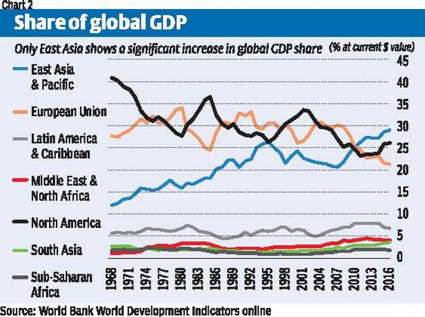
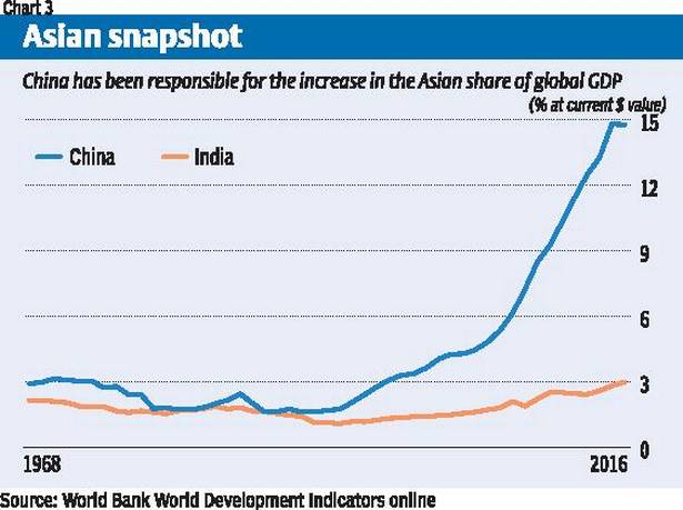
What are the global GDP trends across regions?

  • Chart 2 - provides a look at the evolution of shares of global GDP of the major geographical regions, measured at market exchange rates (for US Dollar).
  • The results are quite startling, as the concept of emerging markets sounds more like mythical than real.


  • The apparent decline in the share of North America and the European Union has been quite gradual, and more marked only after 2005.
  • The only region to show notable increases in share of global GDP since 1960s was “East Asia and pacific” (China, Japan, Korea, Australia & New Zealand).
  • More strikingly, for other regions, there has been little increase in the global GDP share and they continue to be brushing the horizontal axis.
  • Given that population growth rates were higher in these regions than elsewhere, the differences in per capita income would have been even greater.
  • East Asia - Even the greater dynamism of East Asia was largely due to only two countries: first Japan until the late 1980s, and then China recently.
  • Chart 3 highlights the role of China, whose share increased from less than 3% in 1968 to nearly 15% in 2016, with most of that increase occurring after 2002.


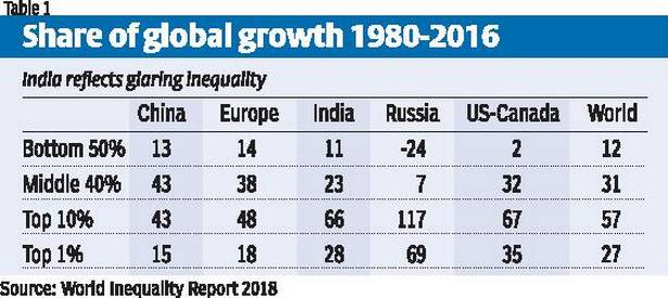
What are the income trends within countries look?

  • Table 1 shows the share of income increases in the period 1980 to 2016 going to different segments of the population in major countries.


  • Once again, it was only in China and EU that the middle 40% of the population (below the top 10%) garnered a considerable income increase.
  • In all other regions, the top decile clearly got away with the lion’s share of income growth, with Russia recording shockingly obscene figures.
  • In India’s case, the experience was also stark - the top 10% got two-third of income increases, and just the top 1% got a whopping 28% share.
  • Hence, these trends illustrate that the rich 10% (particularly the top 1%) seem to be benefitting enormously at the cost of the poor across countries.  


Source: Business Line

Login or Register to Post Comments
There are no reviews yet. Be the first one to review.

ARCHIVES

MONTH/YEARWISE ARCHIVES

Free UPSC Interview Guidance Programme